All About Alt Text

On social media, every image needs alt text. On your website, it’s not quite as simple. How do you know when an image needs alt text, when it doesn’t, and when it needs something more elaborate? Answering that question is also the key to writing strong alt text.
I talked a little about alt text when I wrote about the 5 essential steps you should take when uploading new images to your website. Alt text is worth getting into on a deeper level, so here we go.
Not all images serve the same purpose. Some images add information, some reinforce information, and some are purely decorative. Web images generally break down into 5 categories:
- Informative Images aka images that offer unique information.
- Decorative Images aka images that don’t offer information, but are there for the vibe.
- Functional Images aka images that act as links, buttons, or otherwise initiate some interaction.
- Complex Images aka images with a lot of information like an infographic or diagram.
- Grouped Images. Think 5 stars or before and afters.
Why shouldn’t we put alt text on every image?
The purpose of alt text is to make sure nothing is lost if a webpage is accessed using a screen reader, or if there are internet issues that prevent images from loading properly. But if including that description is confusing, redundant, or irrelevant, it can be an annoyance or a hindrance, rather than a help.
How do you know if an image needs alt text?
Let’s walk through it.

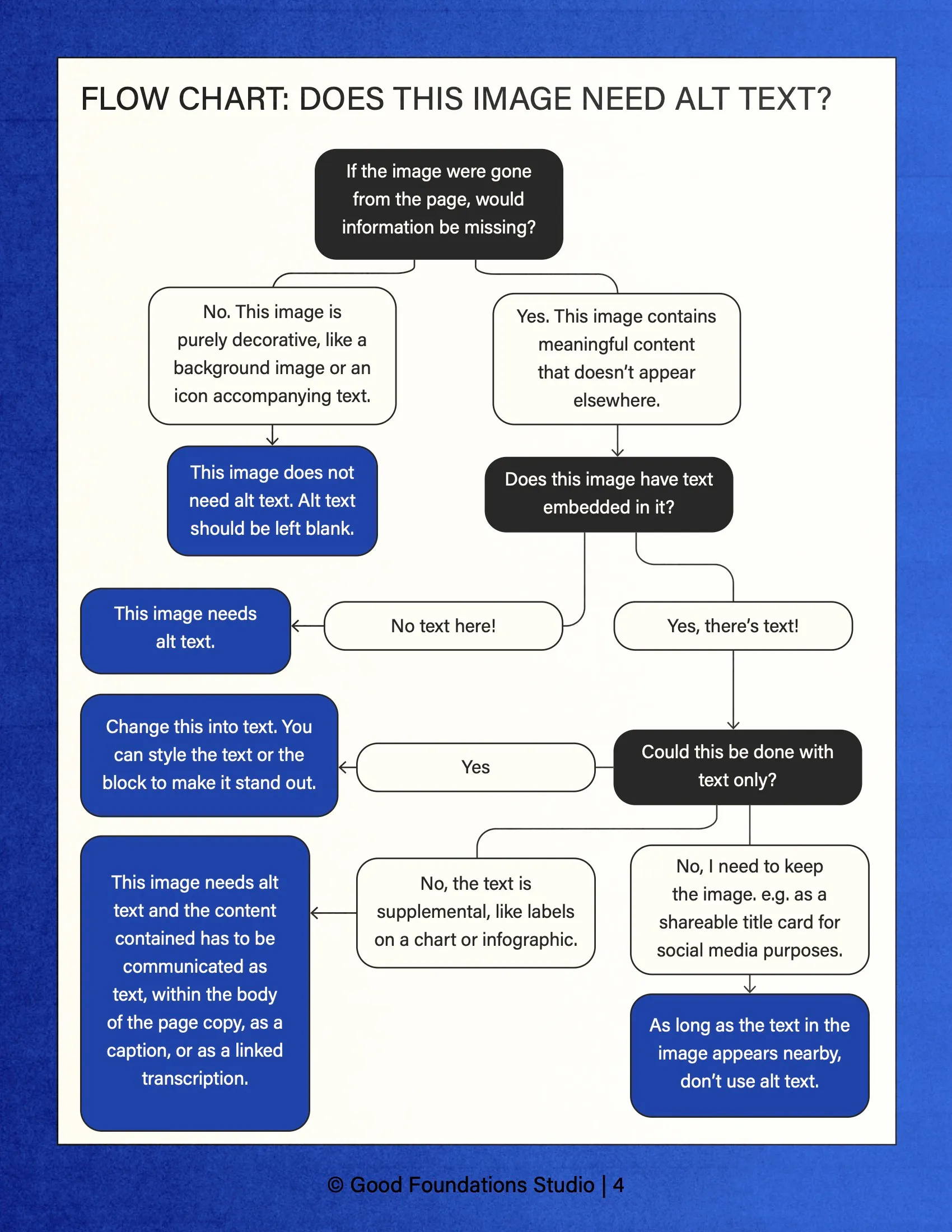
The first question to ask yourself when determining whether or not an image on your website needs alt text is:
If the image were gone from the page, would information be missing?
If the answer is no, this image is purely decorative and alt text should be left blank.
An example of this would be if you had a link to your twitter that was the Twitter icon next to text that said “Twitter.” That icon is duplicate information. If a screen reader were to read it with alt text, it would say: “Twitter link Twitter link.”
Since that would be redundant — and annoying! — that Twitter icon should not have alt text. But if the text were gone, and the icon were the only thing there to link out, it would need alt text.
If the answer is yes, this image contains meaningful content that doesn’t appear elsewhere, then ask:
Does this image have text embedded in it?
This one is pretty easy to answer.
If there isn’t, then you can go ahead and write alt text. If the image is functional, like an icon, describe what it stands for. If the image is a photo or simple graphic, then your alt text should describe what the image or graphic is as precisely and concisely as you can.
If there is text in the image, then ask:
Could this be done with text only?
Yes? Lose the Image.
As a general rule, don’t use a picture of text when you can use text.
A commonly shared suggestion (at least for a time) for creating a header image with a custom decorative font was to create it as an image (including the header text) and uploading that as a background image. Avoid this whenever possible. Change it into text. You can style the text or the block to make it stand out.

No, I need this image.
If you’re dealing with a complex image, like a chart or infographic, this image needs alt text and the information contained has to be communicated as text. This can be within the body of the page copy, as a caption, or as a linked transcription.
If the image contains text and you want to keep it, like a title card you want to keep for social sharing, you can. As long as the text in the image appears nearby, don’t use alt text. It’s now a decorative image.
Tip: If you create blog or social media graphics that are text heavy, copy and paste the text you wind up finalizing into a doc or text file so you can copy and paste it when it comes time to add alt text or (if it’s longer than 125 characters) image descriptions on social and on your website.
How to write good alt text
Now that you’re more familiar with the various functions an image can serve, it should be easier to write alt text. You want to get to the what and the why in roughly 100 characters. Most screen readers no longer cut off at 125 characters, but it’s still best to keep it brief. You don’t need to include with “image of” or “picture of” unless there’s something relevant about it, such as “oil painting of” or “black and white photo of” that helps someone imagine the image based on your description. Here are some guidelines when writing alt text:
- Keep it under 125 characters. You can use a character counter while you write them out.
- Tell your visitor the image’s content and function.
- Get as specific as you can about the details that matter. A barber and a clothing store might use the same picture but focus on different details. The barber might describe the model’s haircut while the clothing store would focus on the outfit. Why are you showing this image to your audience?
- If it makes sense to include your keywords, great! But don’t force it.
Alt text is easier than ever to add if you’re using a website builder, so it’s worth going through and making sure you have alt text where you need it and leave it blank where you don’t. I hope you have a deeper understanding and will go write your alt text with confidence.